The Colour Effect: Enhancing Plant-Based Meat Appeal Through Packaging
A recent report by ProVeg shows to what extent the colour of packaging affects the purchasing decisions of consumers, especially when it comes to plant-based meat products. This aspect can play a major role for brands that operate in the meat-alt sector, who aim to expand their market presence and induce a larger share of consumers to buy their products.
The average time spent by a consumer in choosing a product from a wide range of options on the shelf is currently just 2.5 seconds. This means that the first impression of a product, which often depends on packaging, plays a vital role when assessing a product and in purchasing decisions. Haste and time constraints prevent consumers from processing detailed product information, often relying on visual cues to evaluate the product quickly. This underlines the critical role played by colour in marketing, especially for plant-based meat products, where it could be even crucial.
Red, Blue, and Green: an efficient trio
In a study involving 1,200 respondents equally divided between the United Kingdom and the USA, the researchers examined how warm colours (e.g. red, orange, and yellow) and cool colours (e.g. green, blue, and violet) trigger distinct responses. Warm colours tend to excite and stimulate, while cool colours have a calming effect. This is a familiar condition that commonly applies to the choice of colours to be used in various fields, but is it also effective in the field of plant-based meat?
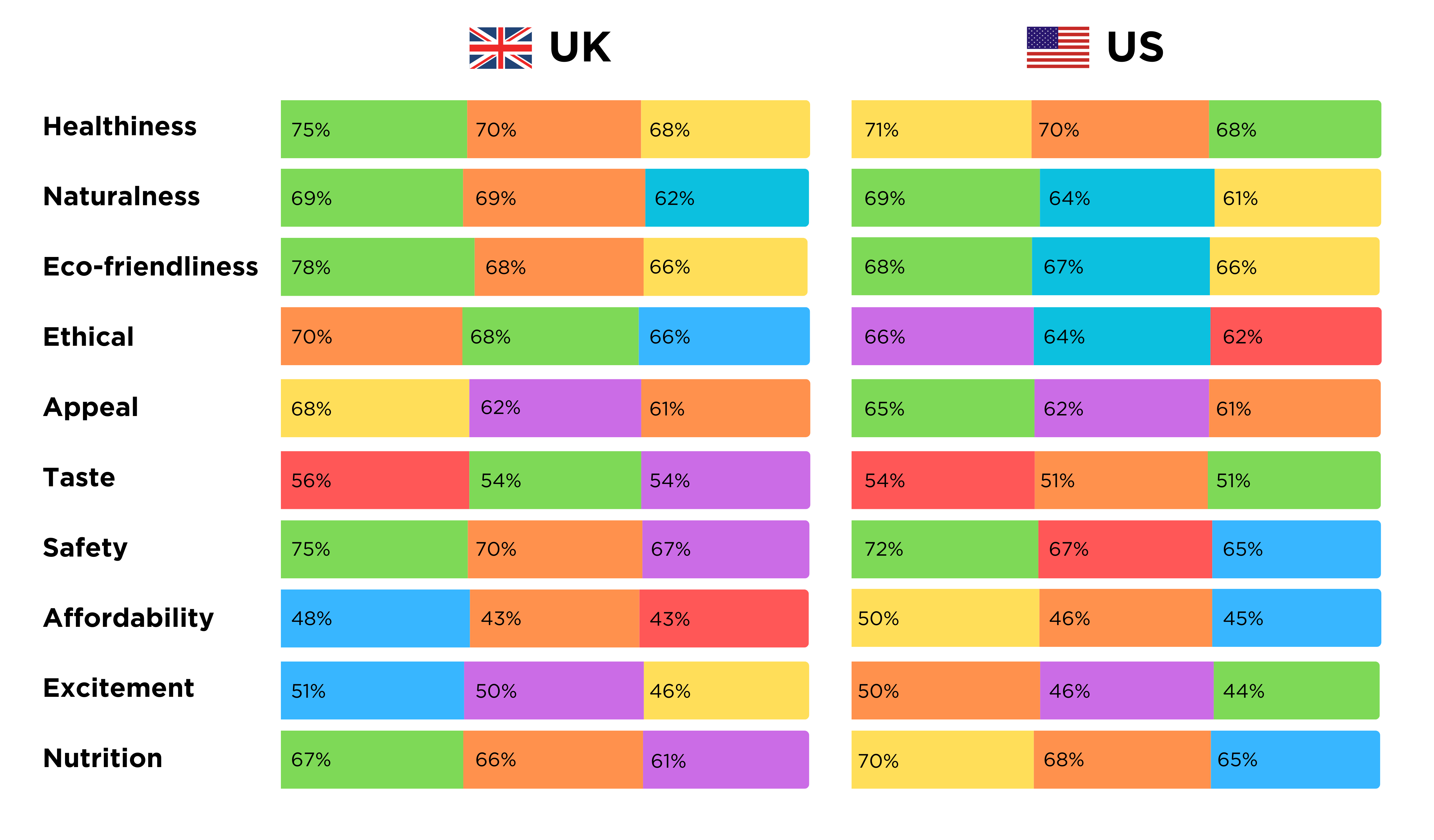
The report analyses the association of colours with various characteristics associated with the product, such as healthiness, naturalness, eco-friendliness, ethical production methods, appeal, taste, safety, affordability, excitement, and the nutritional aspect (Fig.1).

Fig.1 Perception of plant-based meat packaging in the UK and US, ProVeg International
It is clear to see that while the two countries are not always aligned, certain colours such as red, green, and blue tend to predominate over the others. The colour red, for example, is perceived as being associated with taste. A total 56% of consumers in the United Kingdom and 54% in the United States, associate red with a better taste, making it an ideal choice for targeting omnivores and flexitarians who might be sceptical about plant-based alternatives.
Green is associated with health, naturalness, sustainability, and safety, making it a suitable colour for vegetable products if the aim is to communicate these messages, placing taste or affordability in second place.
Blue, on the other hand, is linked to affordability and quality. In the UK, 48% of consumers see blue as indicative of cheap products compared to 45% in the US, although they also associate the colour yellow with this characteristic. Interestingly, the report shows that a significant number of consumers in both countries are willing to pay a premium price for products packaged in blue, indicating its versatility in conveying both affordability and high quality.
Cultural Differences in Colour Perception
The study also explores cultural differences between the UK and US markets, revealing distinct consumer attitudes and behaviours. While 48% of UK consumers and 47% of US consumers feel confident in preparing plant-based meat, there are significant differences in accessibility. In the UK, 57% report well-publicised plant-based options, compared to only 47% in the US.
Furthermore, the identity associated with meat consumption is more pronounced in the US, where 54% consider meat consumption an important part of their identity, compared to 48% in the UK. This cultural nuance suggests that marketing strategies in the US should be emphasising accessibility, affordability, and taste, while campaigns in the UK could benefit from promoting health benefits.
In the UK, blue packaging emerged as the most attractive, stimulating a strong willingness to try plant-based meat products and pay a premium price. In contrast, orange packaging induced a greater willingness to buy regularly and consider the product as a substitute for conventional meat. In the US, orange packaging was the preferred packaging, with consumers showing a strong willingness to regularly try and purchase plant-based meat products packaged in this colour.
Strategic Use of Colour in Packaging
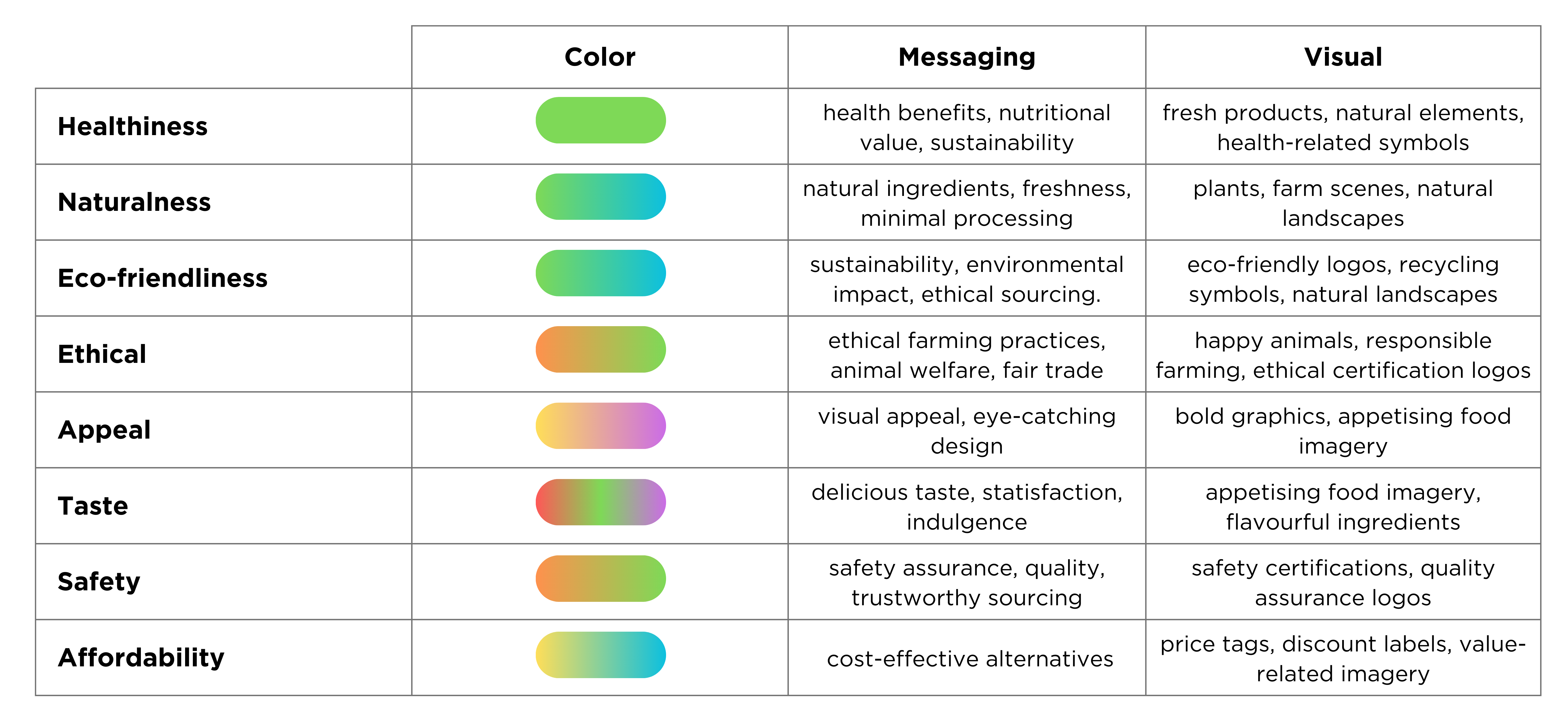
For brands aiming to fully leverage the potential of colours in packaging, understanding consumer perceptions in a specific niche market is essential. Based on the findings reported, we can conclude that green should be used to highlight health benefits, sustainability, and natural ingredients, with images of fresh produce and natural elements. The colour blue appears to be a ‘passe-partout’ that can be a sign of both affordability and premium quality, attracting cost-conscious consumers or those willing to pay more for perceived quality. Red is ideal for conveying feelings of delicious and satisfying taste, with images of appetising dishes and tasty ingredients emphasising this product characteristic (Fig.2).

Fig.2 Effective use of colours on plant-based meat packaging, ProVeg International
The ProVeg report emphasises the powerful role played by colour in influencing consumer behaviour with regard to plant-based meat products. By making strategic use of colours such as red, blue, and green, brands can effectively steer consumers towards their products, ensuring better market penetration and acceptance. Understanding and taking advantage of these colour dynamics can prove decisive in the competitive plant-based meat market, in addition to improving the products themselves in terms of taste and texture.